Tabl....Noooooo!
Taking a light-hearted look at our top 5 worst crimes against Tableau!
Before we begin we should clarify that these generally apply to using Tableau in an organisation, if you’re using it for fun, to learn or taking part in a community initiative like Makeover Monday then we encourage you to experiment, be innovative and go ahead and commit some of these crimes!
Let’s get into it then!
Crime #1: Just using text tables
You’ve just got your hands on an exciting new data set, or even better you’re opening Tableau for the first time. What’s the first thing you do? Drag all the data onto a cross tab, eugh! Come on, you can do better than this:

OK, maybe we’re being a bit harsh and putting data into a table can be a useful way of figuring out what’s in a new data set and the relationship between dimensions, but it’s a terrible way of analysing the data and uncovering trends, insights and stories.
We often hear that this is how users want to see the data, or worse this is how they’re used to seeing it. Whilst it’s important to design for your users need we feel this is a bit of a cop out, text tables are difficult to scan quickly and pick out key information and we think it’s important to help your users use and understand their data more effectively.
What could you do instead?
Use pre-attentive attributes (e.g. length, size, colour) to make it easy to understand data. Here you can instantly see where sales are biggest and which are the most profitable without having to scan the table:
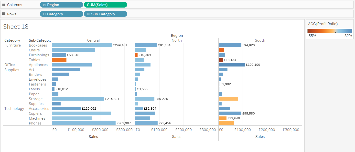
Tableau have put together a great article help article on Why Visual Analytics? and how to use pre-attentive attributes to make the data much easier and quicker to understand so we’re not going to try and beat it here!
If users really do just need the data (perhaps they’re reconciling numbers) in a table then consider if Tableau really is the tool for them, there’s plenty of tools that do this just fine (ahem, Excel!).
If users are new to Tableau and Visual Analytics then there could well be a need to slowly move away from using text tables and demonstrate what’s possible, in this case you may want to start formatting your tables and subtly moving towards a more visual presentation. The article above gives some great steps for this.
Crime #2: Using too many filters
You’ve made a brilliant dashboard, it’s nice and clean and helps users easily see and understand the relevant data but what’s this? Some useful dimensions? What if I add all of these as filters so anyone can slice the data anyway they want, wouldn’t that be brilliant? Um… no:
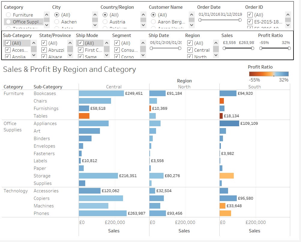
Filters are a brilliant way to allow users to dynamically explore the data and you should definitely be using them. When you have too many it makes your dashboard look confusing and cluttered and users are probably going to get confused with what filters have been applied.
If you’re tempted to add loads of filters we’d suggest to stop and have a think about what your dashboard is being used for and what answers they will want to answer, you may even consider splitting it into separate dashboards for different users and use cases.
What could you do instead?
There are a number of ways you can use filters more effectively than just putting them all on the page. For a dashboard we’re big fans of putting your filters on one line at the top, just below the title, this restricts how many you can realistically fit and really helps you to narrow down which are essential.
We also highly recommend editing your filters to show as drop down lists where possible, it may be an extra click but it puts them onto one line and for long lists it saves space rather than showing all the options, also make sure to only show relevant values in the filter to make it easier for users to select what they want:

These give the essential filters but what if you need to add more, or your users insist on certain filters? Here are a few ways you can get creative with filters:
Use the view where possible - Any item on your view can be used as a filter, users may need to right click to filter or you could build a dashboard that filters sheets depending on what’s clicked on, much cleaner and intuitive and stops you repeating filters.
Use parameters - If you have filters you have to include but are seldom used together consider using a parameter where users can select which item to filter on and then a calculated field to provide the filter options or even better a search box.
Use searches - For fields with many values where the user probably knows what they’re looking for (e.g. customer name, id etc.) utilise the wildcard and custom list options to provide a search rather than a long list.
Create views per user - If you’re using Tableau Server or Online consider pre-filtering the data based on each user, for example filter down to the region users are in then they don’t need to do this or have a filter for it.
Split your dashboards up - If you find you’re having to add too many filters for specific use cases consider splitting your dashboard up, in the same workbook you could have a sales by region and a customer/id specific dashboard rather than adding filters.
Crime #3: Showing too little, or too much context
There’s a lot to be said for keeping your charts and dashboards clean and uncluttered, however we think this is probably taking it a little too far:

What can you tell from this chart? I’d challenge you to draw even one piece of insight from it (hint: we don’t even know if more is good or bad, or even if the axis starts at the top or bottom!)
These can be great used in sparklines showing a trend for just one dimension but are a pretty extreme take on keeping it simple! What about the other end of the spectrum:

To be honest I’d rather have this than the other chart but there’s a lot going on here and it’s difficult to see much detail other than the outliers, at least we know what the colours show and that we’re looking at sales here though!
What could you do instead?
A great tip is to try and strip away everything you don’t need, for every item on the chart ask yourself ‘what is this adding?’ and ‘could I tell this without it?’
This is quite a subjective process and will really depend on your end user preferences but here is an example of adding back in just the right amount of info for our needs:

We don’t think this is perfect and there’s more to be done with this, but this is what I’d call a 1st draft to review with end users and tweak from there, here’s the thinking:
Our title now tells us that it’s giving us Sales by Region for 2019 (this is dynamic and could actually be removed since it’s repeated in the horizontal axis title).
The colour legend has been added so we know what each colour refers to.
The horizontal axis tells us this is based on order date, the year and then the month so we know what it’s referring to.
We’ve added the labels for the first and last values, this allows us to remove the vertical axis as we can see the scale of the chart from the labels, arguably this may want to be added back in.
We’ve added the trend line and made this the prominent part of the chart as it’s the trend we’re interested in as opposed to the details.
We’ve made the lines per region transparent, we could have taken these out but think they’re needed to highlight underlying trends (e.g. the North didn’t see the same spike in September and November which seems to have driven a flatter trend - we’d want to investigate this in more detail.
While this gives an overall picture the power is in drilling down and understanding the detail, generally we’d follow these principles:
This chart should be the main part of a dashboard, we’d add a viz in tooltip with a small commentary to provide more details behind each data point.
There should be a small number of charts that are shown and filtered when this is clicked on, for example top selling products, states etc.
There should then be a drill down onto another more detailed dashboard, this may want to show specific metrics or profitability for the region, state, product etc. selected but it should allow deeper investigation of any trends.
Crime #4: Dashboard chart overload!
You’ve got so much data that would be useful for your end users, what if you could show them not only sales by region but also by country, city and product? What if you added in more detailed weekly sales and sales by category? Before you know it you’ve ended up with a mess like this:

There’s nothing wrong with the intent behind this, we love thinking about what extra value we can add and how we can help to demonstrate the power of analysing data in Tableau but there’s a fine point between this and turning users off.
An easy trap to fall into is forgetting that we’re probably more familiar with the data and have spent more time with it than our end users, what they don’t have is the benefit of what you’ve subconsciously learned from exploring the data.
We highly recommend keeping things simple, you can always iterate and add more later. In fact, a good dashboard should have your end users asking more and more questions and wanting more and more detail which is a great thing!
We try to stick to a couple of general rules with our dashboards:
Try to use charts that tell a story and naturally flow from one to another, when the narrative changes add a new dashboard.
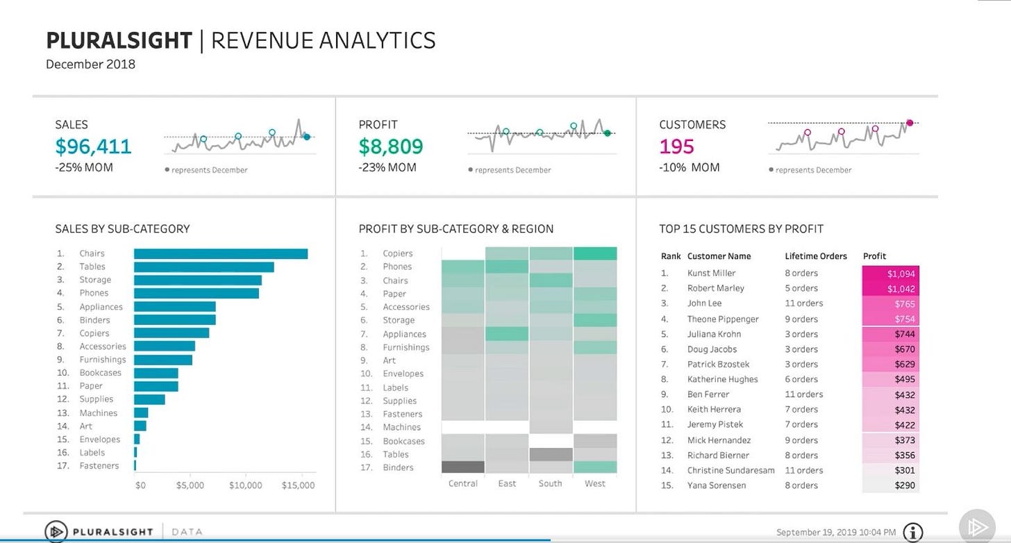
4 charts is a good number to have, we tend to split into quadrants with more info being revealed as you move around the quadrants.
Depending on your use case you may need to use more (or even better, less) than this but the same principles apply of trying to ensure the charts tell a coherent story and are relevant to one another.
If you have a few unrelated metrics to show consider splitting into columns (3 works well) with your key info at the top and more detailed info below (the same approach can be used with rows as well).
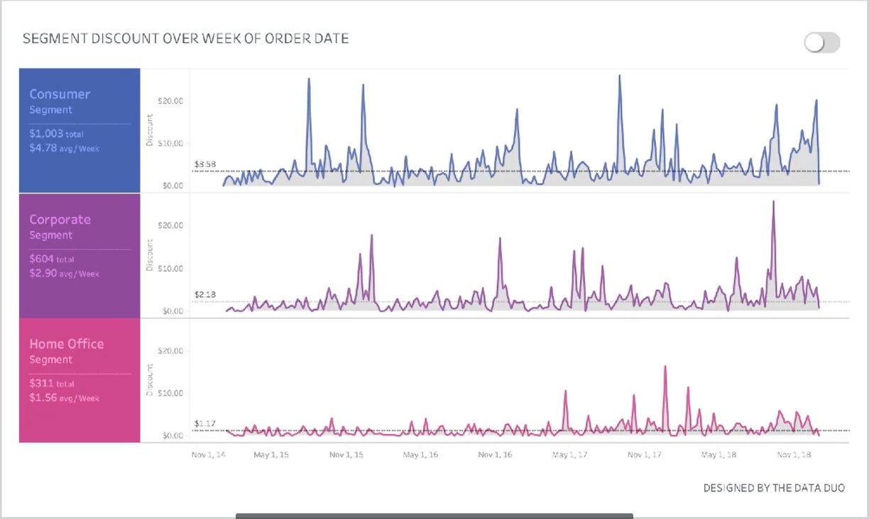
Here’s two great example from the data duo's (@drexelpooja & @acrahen) brilliant pluralsight course on building effective dashboards:
Crime #5: Using the default fonts and colours
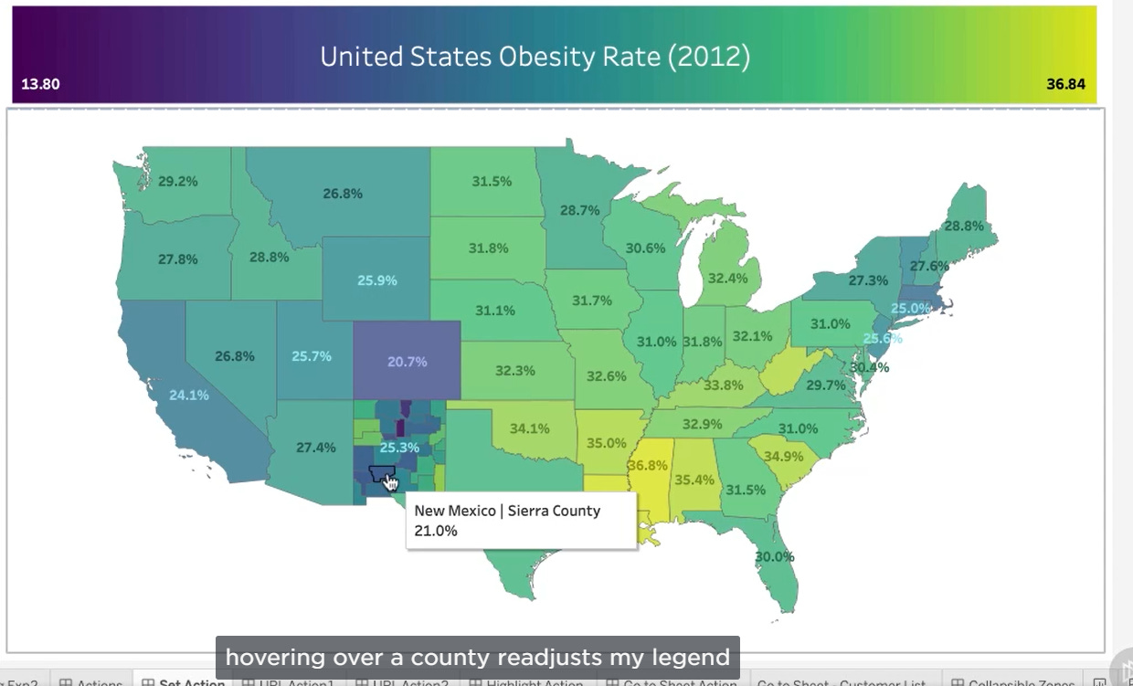
Probably one of the most contentious ones we’ve included, we’re sorry Tableau but the default fonts and colours just don’t do it for us. We don’t have any particular issue with them, we prefer bolder colours personally but sticking with the defaults just gives us the feeling that some charts have been slapped on the page without much thought.
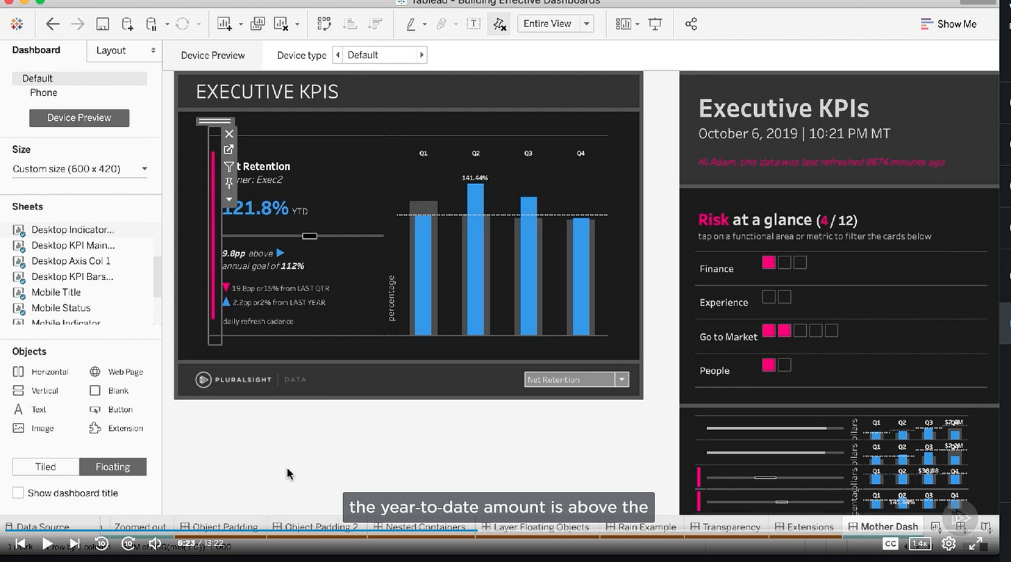
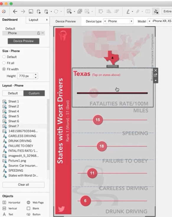
Having your own design language can really help your dashboards stand out, this doesn’t have to be anything more complicated than using a particular font or range of colours but can quickly be identified as your style or brand.
In an organisational setting having a consistent look and feel is also really useful for making new content and dashboards feel familiar and helps people to quickly understand them if the same design, colour and layout principles are used.
We’re big fans of the Segoe UI font family and tend to stick to a hierarchy of using bold or semi-bold for titles and BANs, light or semi-light for axis, commentary and tool tips. We also like to use colours from the ‘Hue Circle’ pallette which tends to be a more varied and vibrant version of the standard Tableau colour scheme.
Check out some of these examples of great use of bespoke colour schemes and individual branding also by the data duo's (@drexelpooja & @acrahen):
There’s nothing wrong with taking inspiration from other designs but it’s important the develop your own style rather than copy others. Here’s some great links on how you can set your own templates and custom colours too:
Embedding templates into Tableau Desktop
Adding custom colour pallettes
Summary
So how many of these crimes are you guilty of? Do you disagree or have any crimes of you own, or have you seen any of these used to good effect? Let us know in the comments or on twitter (@alan_murray84) or LinkedIn.
P.S. To answer our question we’re guilty of all 5 of these, as well as many more crimes against Tableau. Our punishment? 6 months hard labour using PowerPoint, Noooooooooooo!!

