Tableau Tea Break #9: Dynamic Measures, Tableau 2021.1, User Group showcase and more!
This week I show you how to allow users to select measures dynamically, look at the latest 2021.1 release of Tableau and showcase some Tableau User Groups as well as my latest recommended reads
Welcome to the 9th edition of Tableau Tea Break! This week we take a look at:
How To Tableau: Dynamically Selecting Measures
This weeks top Tableau tip plus 2 of my favourites from the archives!
8 Recommended reads from around the Tableau community
A look at the newly released Tableau 2021.1
A quick look at 3 up coming virtual Tableau User Group events and 3 replays of past events
Let’s get on with the issue!
How To Tableau: Let Users Dynamically Select Measures
This week is something that at first glance may look quite tricky but in actual fact is really simple once you’ve done it once. The ask this week was to help out with how someone could allow their users to select which measures they wanted to compare on a scatter plot without having to build a different chart for each.
This is something that I really like in Tableau, being able to give people dynamic and interactive reports that allow them to look at what’s relevant to them. You can do this pretty quickly using a couple of parameters and calculated fields, here’s how:
Step 1: Create the basic chart
Create a scatter plot with any measure you want on the columns and rows axis. We’ll replace these later so it doesn’t matter what you use here. We used the sales superstore example to show profit and sales by country:
Step 2: Create parameters to allow user to select measures
To allow users to select what they want to see we create two parameters, both are exactly the same and we put in a List of Strings with the options we want users to have. Make sure to only include items that you actually have in your data and don’t forget you need one to select the measure on the rows and one for the columns. Here we’ve called them ‘Selected X axis measure’ and ‘Selected Y axis measure’ to make it easy to follow:
Step 3: Create calculated fields to contain the selected measures
Currently changing the parameters doesn’t do anything, we need to create a calculated field for each of the parameters that will populate the measure the user selected. Your calculation should look something like the screen shot below (take to ensure your WHEN statements match exactly what is in the Value field in your parameter and that it’s case sensitive, your THEN statements should also go orange to show they have recognised the measure name):
Step 4: Add your calculated fields to your chart
Now, simply replace the measures on your rows and columns with the 2 calculations you created:
Step 5: Make your parameters visible on the sheet
The final step is to right click each of your parameters and click ‘Show Parameter’, this will put them on your sheet and allow you to select different options. Notice that when you change the parameters the measure changes on the scatter plot now:
Typically you’d place this on a dashboard but this shows how you can allow users to select the measures they want to compare and identify patterns or correlation between them.
You could even take this further by:
Adding an option to select the measure for the colours.
Adding an option to select the measure for the shape size.
Using images, buttons or icons to select the measure and display what has been selected.
If you want to take a look you can find the packaged Tableau workbook here.
Tableau Top Tips
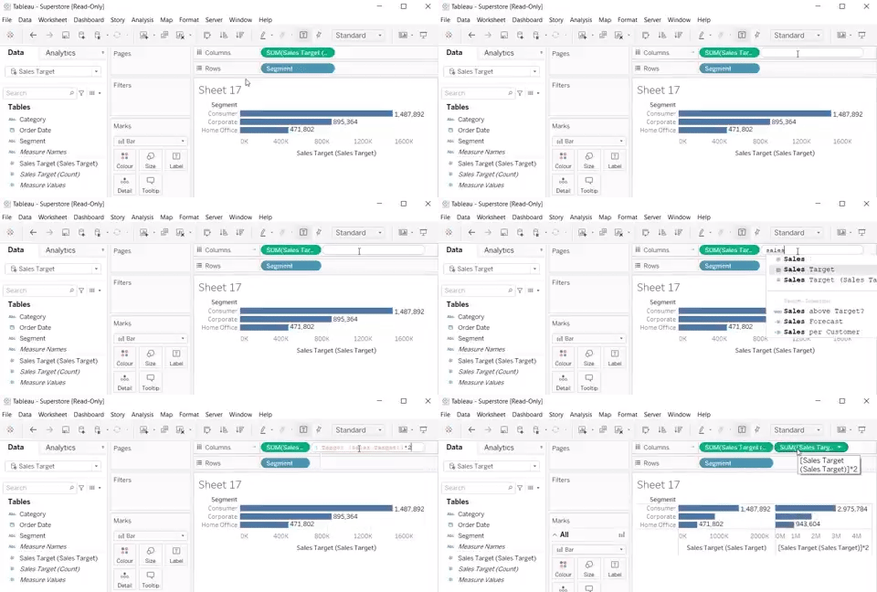
My Tableau top tip for this week is for when you want to add a headline number and trend to a chart on a dashboard. Rather than creating a separate chart you can simply include this in the chart title.
To do so, first make sure the information you want to include is included in the chart already, or add them to detail. When you go into the edit title box when you click Insert you’ll then be able to add dynamic numbers to your title as below:
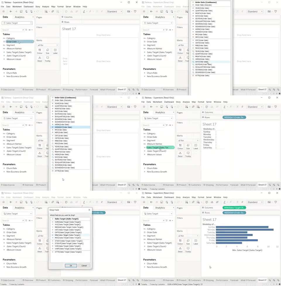
I’ve also dug deep into my Tableau tips archive this week and here are a couple of my favourite tips that you’ll use all the time once you discover them!
Recommended Reads
This week I’ve got 8 recommended reads including how to create fancy navigation buttons, walkthroughs of creating a number of different chart types as well as some interesting topics on using the metadata API, sets, embedding Tableau in Salesforce and some tips on defining using requirements.
Blank Character for Navigation Buttons
By Lindsay Betzendahl | Viz Zen Data | Mar 22, 2021
Navigation buttons have been around for a while now and were a really useful addition. Here Lindsay shows us how you can create fancier navigation buttons like those seen on the landing page example above which was created in Tableau.
vizzendata.com/2021/03/22/blank-character-for-navigation-buttons/
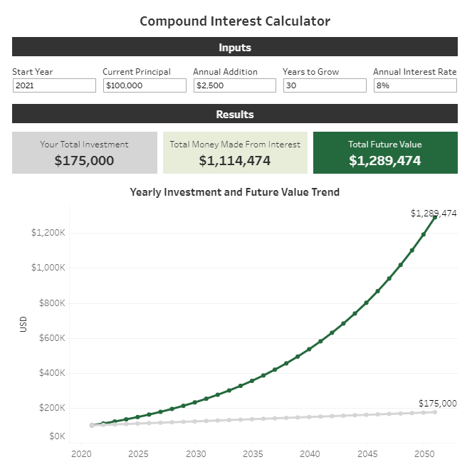
How to Build a Compound Interest Calculator in Tableau
By Eric Parker | OneNumber blog | Mar 25, 2021
If you work in finance, or with financial data, compound interest is something that comes up often. In this post Eric shows how to create a Compound Interest Calculator in Tableau including some of the challenges in doing so.
onenumber.biz/blog-1/2021/3/5/how-to-build-a-compound-interest-calculator-in-tableau
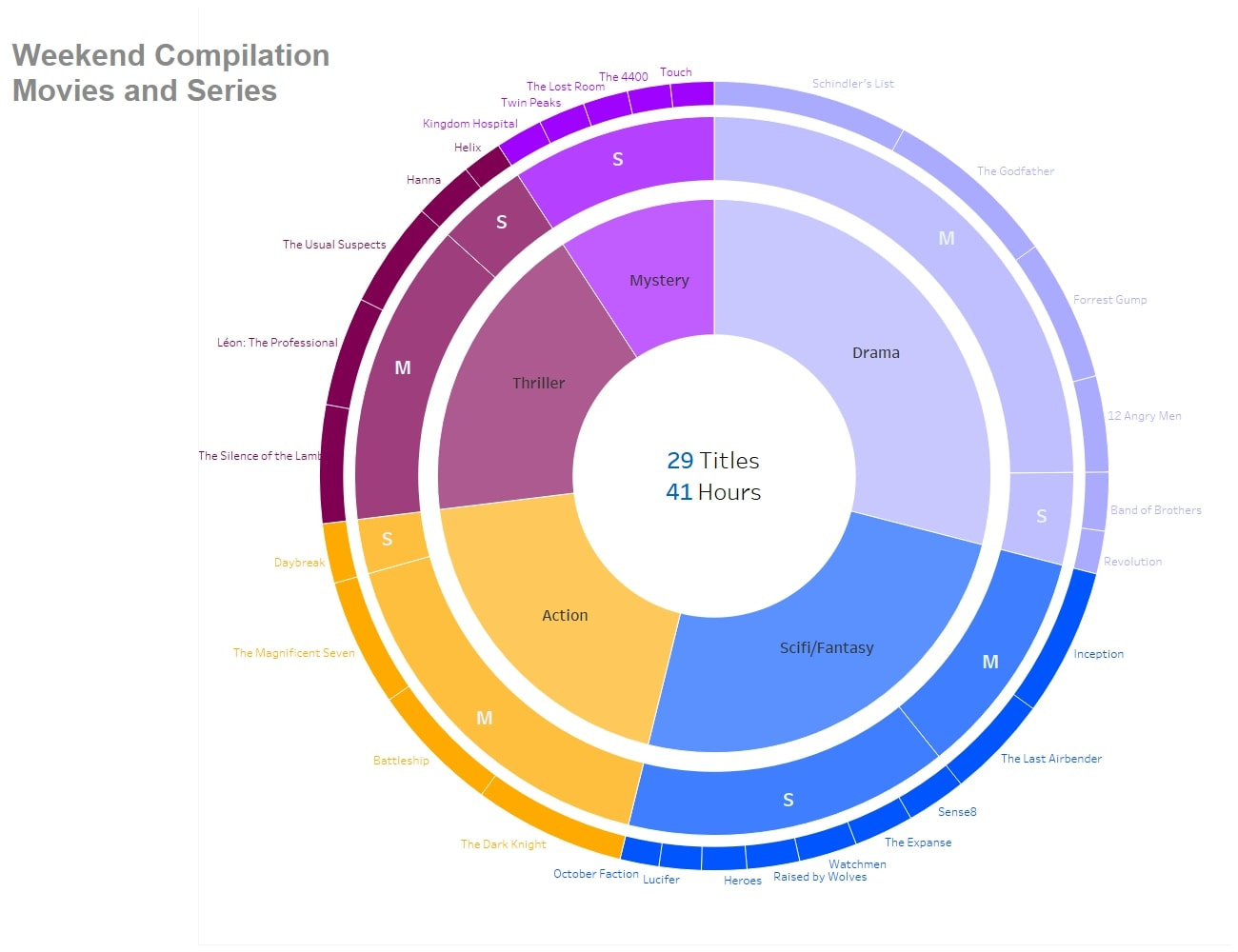
Creating a sunburst chart with map layers in Tableau
By Sebastian Deptalla | InterWorks blog | Mar 24, 2021
Map layers that were introduced into Tableau 2020.4 bring a lot of capabilities beyond it’s intended use case. In this post Sebastian shows how we can use the map layers capability to create a sunburst chart in Tableau.
interworks.com/blog/2021/03/24/create-a-sunburst-chart-with-map-layers-in-tableau/
How to create a waterfall chart in Tableau
By Martin Lisanik | Biztory blog | Mar 18, 2021
Waterfall charts are a really useful way of showing very visually the makeup of a larger grouping. For example you may use this in a funnel type analysis, or to see what makes up a financial budget. Martin gives a very good walkthrough of building this in Tableau.
biztory.com/blog/how-to-create-a-waterfall-chart-in-tableau
Her Data Learns: Metadata 101
By Anya Prosvetova | Her Data | Mar 16, 2021
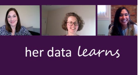
Her Data Learns is a fantastic initiative from Dinushki De Livera and Jennifer Dawes, in their latest session Anya Prosvetova teaches us about the Tableau Metadata API. . Watch our recorded zoom call as she and check out several resources she shared with us below
herdata.net/post/her-data-learns-metadata-101
Data Decision Making: Reporting, Dashboarding and Beyond
By Louise O’Brien | The Information Lab blog | Mar 23, 2021
Louise looks at how we can borrow some ideas from Agile software development methodologies to define ‘personas’ for our dashboard users, this helps to strike a good balance between defining requirements and being flexible to users needs.
theinformationlab.co.uk/2021/03/23/data-decision-making-reporting-dashboarding-and-beyond/
Embedding Tableau Dashboards in Salesforce
By Issye Margaretha | Biztory blog | Mar 19, 2021
Embedding Tableau dashboards into other systems is a great of way providing insight and analysis directly within a users workflow, for example rather than having a seperate dashboard requiring users to log into Tableau you could embed it directly where your users are working. In this post Issye shows how easy it is to embed Tableau dashboards within Salesforce.
biztory.com/blog/embedding-tableau-dashboards-in-salesforce
An Introduction to Tableau Sets
By Katrina Johnson | Tessellation blog | Mar 19, 2021
Using sets in Tableau is a really useful way of grouping your data dynamically and highlighting specific items. Here Katrina introduces us to Tableau Sets and takes us through an example of using sets to identify the top and bottom items in a data set.
Tableau News
The biggest news this week in the release of Tableau 2021.1, Einstein Discovery is the big ticket new feature, below is a summary of the new features as well as where to find more info and explorations of the new features:
New Features:
Einstein Discovery in Tableau - Tableau have now made it’s Einstein Discovery available as a dashboard extension in Tableau Desktop. You’re still going to need access to Salesforce and an Einstein Discovery prediction defined and deployed in Salesforce so what’s perhaps more interesting is seeing the start of further integration between Tableau and Salesforce’s other products.
Quick Level of Detail calculations - This is the feature I’m most interested in, while the introduction of relationships removed some of the requirements for Level of Detail (LoD) calculations they’re still used and now you can simply drag a measure onto a dimension to create an LoD calculation really quickly!
Unified notification experience - Let’s be honest, the notifications in Tableau aren’t the best, this looks like a massive step forward with all your notifications in once place as well as the ability to see whether they’re read/unread and decide how you want to be notified.
Here are some really useful links to get more detailed information the new release and features:
Tableau 2021.1 Release Blog Post
The post above from Tableau gives us a run through of what’s included in 2021.1 with a focus on the inclusion of Einstein analytics.
What’s New In Tableau Webinar
If you prefer to watch than read you can check out this 14 minute on demand webinar showcasing the new features in Tableau 2021.1
Tableau Time Tableau 2021.1 Playlist
Tableau Tim has 8 videos looking at all the new features in Tableau 2021. in this playlist, broken down into smaller bite size videos.
Tableau User Groups
Last week we shared some details of where you can find local Tableau User Groups and events and the benefits of attending these. Here we share some highlighted upcoming events as well as where you can catch replays of recent events.
Upcoming virtual events
NYC Tableau User Group: DataDev edition - Mar 31 @ 5pm (EDT)
Atlanta Tableau User Group: Iron Viz Atlanta - Apr 22 @ 1pm (EDT)
Colorado SLED Tableau User Group - Apr 7 @ 10am (MDT)
Recent event replays
Server Admin Tableau User Group - 19th March
Data + Women London - 16th March
North Texas Tableau User Group - 18th March
I hope you enjoyed this issue! If you have any feedback or suggestions for future editions feel free to get in touch by email, twitter or LinkedIn.
Don’t forget to check out my latest project Tableau Jobs too.
See you in two weeks for the 10th edition of Tableau Tea Break!
Thanks,
Alan @ Tableau Tea Break


