TTB #8: Heat grids, top tips, virtual escape rooms, managing feedback, datafam finder and more!
This week I show you how to create a heat grid, share where to find tips, look at what's new in Tableau and share some cool users of Tableau as well as some great guides, advice and learning!
Hi There!
First of all, an apology for everyone who’s been missing Tableau Tea Break lately! I’ve been pretty busy with work and my new project Tableau Jobs and haven’t been able to publish a Tableau Tea Break for a while but we’re back this week with a bumper issue for you.
From this week I’ll be publishing Tableau Tea Break every other week on a Monday, if there’s anything you’d like to suggest for future editions then feel free to get in touch. using the details at the end.
On with this week’s issue!
How To Tableau: Heat Grids
In my regular How To Tableau… feature I share with you a real example that I’ve worked on, been asked for help with or seen recently.
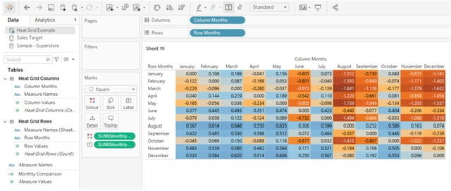
This week I was asked how we can take a table like this, and make it easy to compare any of the results to any of the other results:
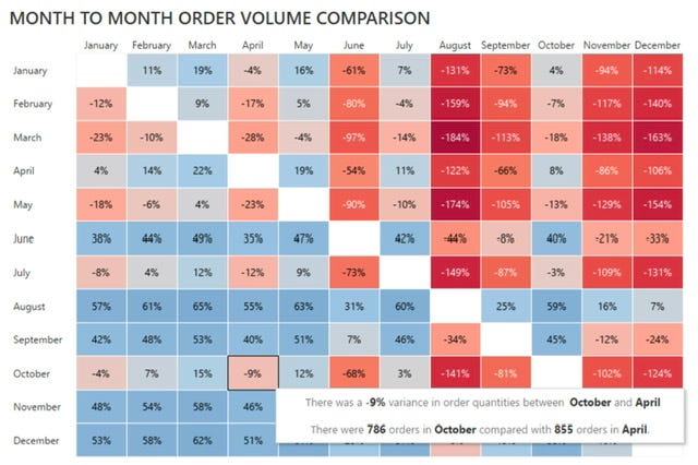
The solution we came up with was a heat grid that looks like this:
Below is a quick overview of how to do this, for more details you can find a full walk through at How To Tableau: Heat Grids
Aggregate the data
If the data isn’t already aggregated to the level you want then create a copy with the data aggregated to the required level. The easiest way to do this is to create a cross tab, export it and then copy the required data back to Tableau.
Take a copy of the data and join it back to itself
Once you have the data aggregated you’ll need to create a copy of it and bring that into Tableau, this will be used to create a dataset which has a row for every combination within your data.
When you bring the copied data in, join it to your original data with a calculated join. The calculated join can be anything as long as it’s identical on both sides, this results in a data set where every row is joined to each other.
Create the grid
You’ve got the data you need for this now you just need to put it together. In each row of data you’ll have a result for the first dimension (months in our example) and one for the second, create a calculation that divides or subtracts one from the other depending on whether you want to compare absolute (numbers) or relative (percentage) changes).
Drag your first dimension (we call it rows data in our example to make it easier) to the rows and the second to the columns (again, we call it columns data in our example) and then the calculated field you created to the text marks card and then to the colours marks card and you should have something that looks like this:
Make it look good!
What you have already will do the job but we can do better than that! Follow the steps in the full article to change the formatting, colours and borders, add a tooltip and remove the same month comparisons to get it looking like our final output.
For detailed steps on how to do this please see my walkthrough at How To Tableau: Heat Grids
Tableau Top Tips
This week, rather than bring you my own top tips, I’ve decided to share my top 3 places to find Tableau Tips & Tricks in order to celebrate the launch of Zak Geis’ excellent new Data Theories web site. Here they are, in no particular order:
Data Theories - Tableau Design Tips
You may have seen the recent tableau design tips posts from Zak on social media, Zak has now compiled these together on his new site and we highly recommend checking it out for some excellent Tableau design tips.
Miss Data Viz - Tableau Tip Tuesday
Run by Lorna Brown this used to bring a new Tableau Tip every Tuesday. Sadly it stopped in September (if you’re reading Lorna, any plans to bring this back?) but you can still view all of the tips at the site above.
Andy Kriebel’s site contains a great section with lots of Tableau Tips, well worth scrolling through and checking out for tips and tricks as well as inspiration on what’s possible
Do you have any favourite tableau tips or resources for finding tips and tricks? If so you can share them with me at @AlanMurray_TTB
Recommended Reads:
I’ve got a bumper list of recommended reads for you this week from across the Tableau community in February and March. This weeks recommended reads include a range of cool tableau use, how to guides, advice, tips and inspiration.
COMMUNITY PROJECT: Real World Fake Data - Social Media/Marketing Dashboard
By Mark Bradbourne | Sons of Hierarchies | Mar 2, 2021
This week Mark brings another from his Real World Fake Data initiative where users build real world business related dashboards based on a given data set. Some really useful examples and templates for building real world dashboards in here.
https://sonsofhierarchies.com/rwfd-recap-social-media-marketing/
COOL STUFF: Tableau Virtual Escape Room!
By Jérémy Calloud | Biztory Blog | Feb 25, 2021
This is a really cool walkthrough of how Jeremy created a virtual escape room in Tableau, it’s a great bit of fun and some of the techniques can be applied to more business related problems.
https://www.biztory.com/blog/tableau-virtual-escape-room
ADVICE: Managing user feedback
By Autumn Battani | Tesselation Blog | Feb 2, 2021
This is a really useful post from Autumn on both how to manage and action user feedback as well as a great template to track and provide visibility of feedback.
https://tessellationtech.io/managing-user-feedback/
TIPS: Bringing custom colour to your dashboards
By Chelsea Morgan and Kendra Allenspach | Interworks Blog | Mar 8, 2021
This is a really useful guide and what to think about when adding colour to your dashboards, as well as how to add custom colours and links to some top tools for creating and checking good colour schemes.
https://interworks.com/blog/2021/03/08/bringing-custom-color-to-your-tableau-dashboards/
LEARN: A beginners guide to getting started with Tableau
By Alicia Bembenek | Tesselation Blog | Jan 26, 2021
Everyone’s got to start somewhere and this a really good introduction on how to get started with Tableau as a beginner. There’s plenty of tips and links as well as replay of the getting started webinar delivered by Alicia.
https://tessellationtech.io/a-beginners-tableau-tutorial-how-to-get-started/
HOW TO: Create a row wise drill down
By Avinash Reddy Munnangi | VizArtPandey | Feb 14, 2021
Drill downs are another one of those items in Tableau where the default functionality is useful but quite often you need something more bespoke. Here we learn how to build a drill down that expands the selected row only.
https://vizartpandey.com/tableau-row-wise-drill-down/
BLOG SERIES: Drilling up/down in Tableau
By Rosario Gauna | RosarioViz | Mar 8, 2021
Sticking with drilling down/up, In this epic series of posts Rosario takes us through everything there is to know about this topic and a number of techniques for given scenarios, well worth spending some time to read through this!
LEARN: Geospatial analysis with map layers
By Marc Reid | datavis.blog | Feb 28, 2021
Tableau have added a lot to the mapping and geospatial analytic capabilities over the past few years. In this post Marc takes us through some techniques for doing geospatial analysis in Tableau.
https://datavis.blog/2021/02/28/geospatial-analysis-with-map-layers/
Bonus recommended reads - Best of the rest!
There were so many great articles I wanted to share this week I found it a hard task cutting my list down so I decided I’ll just share some of the best of the rest with you anyway!
HOW TO: Setting up a nested sort on multiple fields in Tableau
By Eric Parker | OneNumber Blog | Feb 11, 2021
Nested sorting can be a bit of a pain in Tableau, sorting on one field is a piece of cake but when you then when to have a secondary sort by another field it can be challenging. Eric walks us through a way of doing this using a calculated field here.
https://onenumber.biz/blog-1/2021/2/10/how-to-set-up-a-nested-sort-on-multiple-fields-in-tableau
HOW TO: 2 ways of creating dynamic reference lines in Tableau
By Pat Lucas | Data School Blog | Feb 26, 2021
Reference lines are a really useful way of showing key points in time series data, such as a particular date or perhaps differentiating between actual and forecast data. Pat shows a couple of ways to create these dynamically in this post.
https://www.thedataschool.co.uk/patrick-lucas/2-ways-of-creating-a-dynamic-reference-line-in-tableau
INSPIRATION: What does it take to get into the Data School?
By Andy Kriebel | Data School Blog | Feb 23, 2021
Ever wondered what it takes to get into the Data School program? Andy Kriebel shares some examples of the standard it took to get accepted into the Data School 21 and 22 cohorts.
Note: If you think you could make the grade the Data School take on a new cohort every other month, you can find out how to apply here.
https://www.thedataschool.co.uk/andy-kriebel/ds22 & https://www.thedataschool.co.uk/andy-kriebel/ds21
ADVICE: 7 Tips for the Tableau Certified Associate exam
By Danielle T. | Fruits Of Your Data | Feb 8, 2021
Check out these tips on preparing for and taking your Tableau Certified Associate exam, one day I really should get around to taking mine!
https://fruitsofyourdata.com/2021/02/08/so-you-want-to-become-a-certified-tableau-desktop-associate/
ADVICE: Why Tableau?
By Mark Bradbourne | Sons of Hierarchies | Mar 1, 2021
I love this post from Mark talking about why he focusses on Tableau and the benefits it brings, it was a timely reminder for me during our roll out of Tableau and helped to reset my messaging about why we chose Tableau!
https://sonsofhierarchies.com/why-tableau/
TIPS: Designing better business dashboards
By Pawan Sachdeva | VizArtPandey | Feb 10, 2021
This post features some top tips and making dashboards that are relevant in a business context but also are scalable and repeatable.
https://vizartpandey.com/how-to-design-better-business-dashboards/
TIPS: What to do when your Tableau extract takes too long to generate?
By Eric Parker | OneNumber Blog | Mar 11, 2021
Here Eric shows a top tip for something you can do if your data extract takes too long to generate within Tableau Desktop, there’s also a link to some other tips and tricks to try to improve your extract performance too.
ADVICE: Bar charts - The good, the bad, and the ugly
By Pierre Hansquine | Biztory Blog | Feb 15, 2021
This is an interesting piece exploring the use of bar charts, both good and bad. There are some really interesting points in here to consider when automatically reaching for the good old trusted bar chart!
https://www.biztory.com/blog/bar-charts-the-good-the-bad-and-the-ugly
Highlights of the week
In this new section I share some of my personal highlights from the past couple of weeks, here’s what I’ve been up to this week:
Being included in Datafam News and Best of Tableau Web
In the past few weeks I’m incredibly honoured to have had some of my work included in Best of the Tableau Web and Datafam News from Data + Love. I really enjoy putting together bot Tableau Tea Break and Tableau Jobs so it’s great to see other people finding them useful too!
Tableau demos …
At work I’m currently leading the roll out of Tableau and Tableau server across the organisation. Recently I’ve been working with our Learning & Development team to arrange overview sessions on Tableau to raise awareness across the company.
For our first session we had almost 150 attendees, considering we only went live four weeks ago and we’re a company of just under 1,000 people (and this didn’t include the 200 people part of the initial roll out) I felt this was a great turn out and indication of just how valuable Tableau’s going to be for us.
Hosting a breakout room at a TUG
Last week I had the pleasure to be invited to host a break out room at the Tableau Community Drivers User Group, it was a great session and really interesting to hear everyone’s challenges and ideas for developing internal user groups.
My top 3 takeaways were:
An internal community/CoE means something different to everyone - there’s no one size fits all so make it tailored to your companies needs and culture.
A community champion doesn’t need to be a Tableau expert - their role is to build engagement and bring people together into a community, not to be a Tableau SME or power user.
Community building is hard - Don’t be discouraged, most of the communities you see have taken years of hard work to begin, they all start from a small number of people getting together and grow from there!
If you’re involved in your internal Tableau community or interested in setting one up I’d recommend getting involved in the community drivers TUG, you can find future events at https://usergroups.tableau.com/communitydrivers
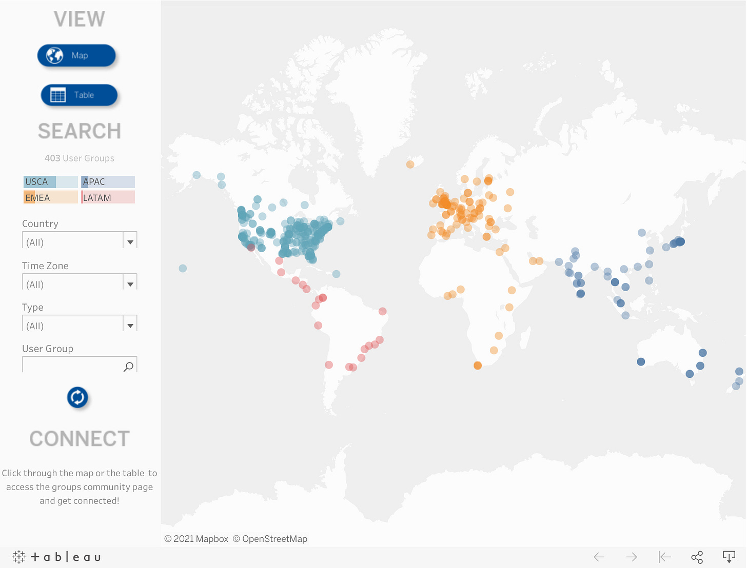
Tableau User Groups are a great way of learning about Tableau and learning from other people, if you haven’t been to one you can use this dashboard to find user groups:
If you’ve got any recommendations for a Tableau User Group event I should join, or if you’re currently involved with a Tableau User Group and would like to feature it in a future Tableau Tea Break just drop me a note with the details.
Tableau News
There’s been quite a lot going on since my last post so quite few things to catch you up on in this edition!
Tableau 2021.1 is in beta, the coming soon page gives details of what’s likely to be included. Integration of Einstein Analytics seems to be the big ticket item though its the Quick LoDs and Improved Notifications we’re looking forward to.
Tableau quietly removed the minimum license requirements for Viewers and Explorers on Tableau Server/Online. The minimum 100 Viewers / 5 Explorers no longer apply as can be seen on the Tableau Pricing Page.
Tableau Jobs is a project I launched a few weeks ago bringing a hand picked list of Tableau Jobs to you each week. Check it out if you’re looking for a new role!
The first Tableau Data Dev Day is happening on May 20. Seems like there’s lots in the pipeline for the data dev program so worth checking this out.
2021’s Tableau Zen Masters have now been announced, congratulations to the 14 new Zen Masters and 29 returning for another year!
The Tableau Community Hub was launched in February, this brings lots of changes and updates to the Tableau Community, make sure you check it out!
Ever wanted to find someone from the datafam to hang out with? Well know you can by using the excellent Datafam finder from Kevin Flerlage!
I hope you enjoyed this issue! If you have any feedback or suggestions for future editions feel free to get in touch by email, twitter or LinkedIn.
Don’t forget to check out my latest project Tableau Jobs too.
See you in two weeks for the next edition of Tableau Tea Break!
Thanks,
Alan @ Tableau Tea Break


